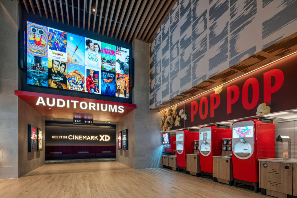
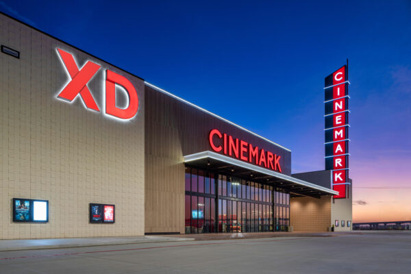
In today’s experience economy, the visual power of corporate branding relies on much more than just a logo. A cinema looking to distinguish itself and the unique experience it offers can start with a logo, of course, but it can also extend its visual identity to its theater architecture, lobby interior design, or the lighting and display of its concession stand. That’s what Cinemark, the nation’s third-largest circuit, is doing in the gradual rollout of its new branding, which visitors will see throughout 2023. Boxoffice Pro asked Wanda Gierhart, Cinemark’s global chief marketing and chief content officer, about the circuit’s new identity.
How important is the right branding strategy for a major circuit in today’s cinema industry?
Consumer tastes have changed and [movie theaters] have become part of the experience economy. To distinguish ourselves, we need to offer a complete night out—from the time you think about going to a movie to when you enter the theater to when you’re in the auditorium watching a movie. We have to up the ante on that whole experience, because we can’t distinguish ourselves as brands unless we set out with a very methodical [plan for] what that experience looks like.
[At Cinemark], our project started before the pandemic by asking ourselves how we were going to grow and what was going to differentiate us in the future. If you look at all the share-worthy experiences that people post on Instagram, you realize just how much experience matters. Over time, [social influencers] have slowly shaped consumers’ expectations and their requirements for a venue. It’s multisensory now. Years ago, people primarily came to theaters to see movie; we didn’t need to do much, other than put up the walls and have a few concessions available. Now we have to create an experience from the beginning to the end—and evolve our spaces accordingly. We spent a lot of time thinking about our vision, our mission, our positioning, and where we want to sit among our competitors—what makes us different? [Who are we] as a brand, and how do we show it? And then how do we express it the same way in all our communications? Everything needs to feel connected. During this whole process, we used the filmmaking concept of mise-en-scène to inform our decisions. What are all the elements we’re going to apply to set the scene we present to our audience—all those things that create an immersion into a new space? As an industry, we have to create more immersive, dynamic experiences that think through all these parts from beginning to end. They all have to live together harmoniously. They have to work together and feel like they’re congruous to the customer to create a whole experience.
How did you conduct the research that led to your design decisions for Cinemark’s new look?
We did a lot of in-depth research. We worked with our in-house creative and strategy teams, and then augmented that work with some outside agencies to do a lot of qualitative and quantitative research. Through that process we sought to understand how the customer was moving through our theaters, their needs, and the key points in their relationship with us that we could improve upon. It had been several years since we updated our logo to make our brand fresher and more energetic. That’s why we went through extensive consumer-journey research. We applied different research techniques to figure out the high and low points when someone walks through our lobby and passes our concession stand. Understanding the customer experience of that interaction: What happens after they buy their concessions? What does that moment feel like for them? How do they feel when they walk through the hallways? When you think about other entertainment venues, take Disneyland or Universal Studios for example, there is a consumer journey in moving through a space from beginning to end. We really wanted all those consumer touch points to feel joyful and immersive, creating a sense of anticipation so that by the time you walk into the auditorium and find your seat, the entire process feels great.
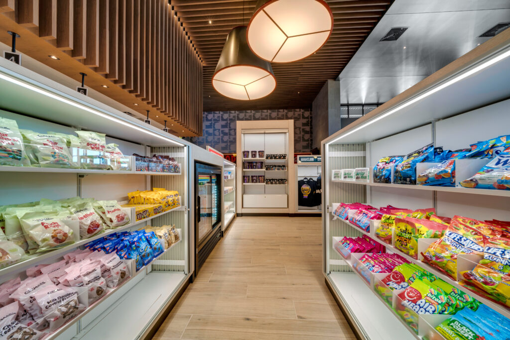
We really focused on making the interiors feel bolder and warmer by using updated materials. People go to the cinema to indulge, so we wanted to create more extensive food and beverage experiences. In the redesign of our Missouri City location, you’ll see new fixtures where we’re lighting our candy shelves, laying out the candy bars and merchandise to make it fun and indulgent. We spent a lot of time working on dramatic lighting throughout our lobbies and hallways to keep that sense of excitement and anticipation building as you walk into your auditorium.

How have you begun to roll out the new branding elements in your theaters? Is there a time frame for the rollout in your Latin American circuit?
We want [our theaters] to feel immersive, and we want our customers’ ticketing journey to feel frictionless. We’ve placed a lot of focus on service and invested capital in the experiential side of our circuit. We [already] have everything set up once you step inside one of our auditoriums. We have the number one private-label premium large-format brand in the country, Cinemark XD, we have the highest percentage of recliner seating, we offer innovations like D-Box immersive seating, and we have the best light levels through our rollout of laser projection. Now we are trying to focus on all the other parts of that experience. It’s going to be a phased rollout across our circuit. We redid our logo, which we hadn’t touched in several years. We redid all of our employee uniforms—that will begin to roll out this year—and updated all our F&B vessels. We first unveiled those elements on our digital channels and have begun rolling them out to each of our new theaters to showcase the new branding. We’re going to continue rolling it out across our theaters over the course of the year. The challenge has been in figuring out when and where to roll it out and getting everyone to buy into it. I say that because the rebrand is not only visual, but it’s also experiential. We’re rebuilding all our training modules; it’s not a one-year journey, it’s a three-to-four-year journey.
You mentioned the importance of launching the rebrand by starting with your digital presence, which is how brands connect most closely with consumers—social media, apps, websites. They are no longer confined to physical spaces.
We first started building out all our digital capabilities, going through a digital transformation, as part of a whole service proposition to make visiting our theaters as frictionless as possible. We want to make it easy for people to buy a ticket and have a great night out with us. After that, we ensured that once you’re in the theater, we smooth all those touch points with features like our Snacks in a Tap ordering system, where you can buy your concessions ahead of time through our app and have them delivered to your seat. We revamped our website, launched our mobile app. It’s so important to have all these elements work together in harmony; it helps us achieve that fully immersive experience. We want everything we’re known for to be bolder than life and cinematic, and that is something that carries over to our investments like XD screens and laser projectors. We use them in our communication channels to constantly remind our customers of our ecosystem. If your building exemplifies that excitement they see online, if your customer arrives and experiences an elevated level of service, then all your communications are just supporting and reinforcing that ecosystem. Every touch point has to work in tandem with each other.
What makes you most excited about the process of establishing a brand and communicating it with your audience?
Introducing an integrated philosophy of design and branding into the exhibition business is only going to help improve the moviegoing experience. I think it’s our future. We have to meet the customer where they’re at and follow them in the direction they’re moving. Rolling this out internationally to the rest of our circuit outside the United States, which will be part of our next wave, will help create distinction for our brand—which then helps you maintain or gain market share because you’re seen as a complete experience, a destination, a complete night out. It makes going to the movies fun, a place people like to visit. That experience needs to have form and function: Is it conveying the brand? Does it enhance the customers’ experience with us from the time they buy a ticket to the time they leave the theater? If we’re on our game and we’ve thought through all of those touch points—honing them and making them feel congruous—it will make visiting us an exciting night out.


Share this post